2011; Icon design, User Interaction design
Automation Software: Icons 2, Symbol Libraries
Fully intuitive control, visualization and information technology systems.
Fully intuitive control, visualization and information technology systems.
The client
Rockwell Automation, one of the world’s largest companies dedicated to industrial automation and information, makes its customers more productive and the world more sustainable. Headquartered in Cleveland, OH, Rockwell Automation employs about 21,000 people serving customers in more than 80 countries.
The work
The software branch of Rockwell Automation, Rockwell Software, needed front-end graphics developed for the overhaul of its automation and control software. This included the design of more than 300 unique, scalable, symbolic icons, divided into two libraries (Buttons & Status Symbols, Electrical Symbols).
The challenge

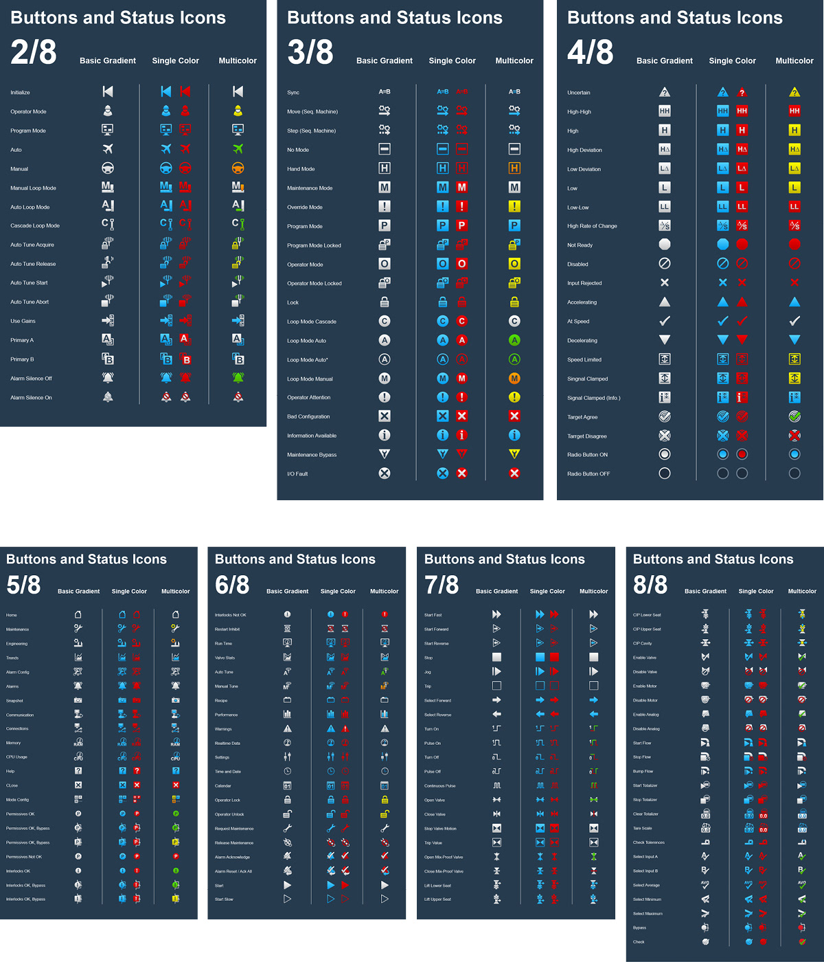

The software has four main modes: Operator, Program, Auto and Manual. Can you guess which is which?
When icons are related to a particular mode, that mode's color is used. This helps establish a visual relationship: "auto tune" and "auto loop" icons are green, like the Automatic Mode icon; The sequencing machine's "move" and "step" icons both deal with its program mode, and are therefore blue.
When icons are related to a particular mode, that mode's color is used. This helps establish a visual relationship: "auto tune" and "auto loop" icons are green, like the Automatic Mode icon; The sequencing machine's "move" and "step" icons both deal with its program mode, and are therefore blue.
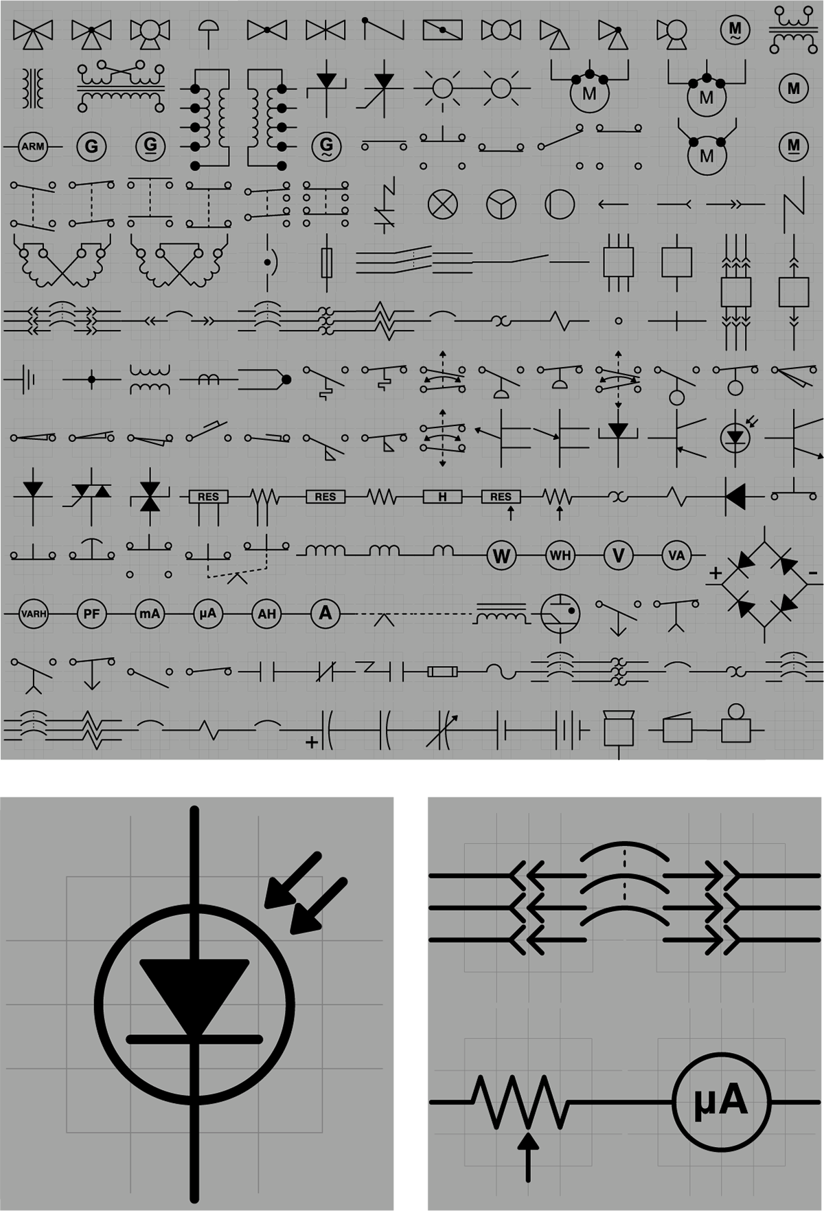
The Electrical Symbols Library is composed of nearly 200 established symbols for communicating an electrical circuit. By mapping each symbol to a universal grid, any symbol could be "connected" to any other symbol, ensuring efficiency when building a circuit diagram. I reused shapes, angles and curves to provide a technical and consistent feel to the library.